Watson for Patient Safety
Team | Watson for Patient Safety, IBM Watson Health
Responsibilities | User Research Lead, Content Design, UX Design
Project Overview
Watson for Patient Safety (WPS) is an AI + healthcare application developed by Watson Health. As the UX researcher in the initial exploratory design team for WPS, my responsibility was to research and prototype experiences around a single overarching question — how do we responsibly and successfully incorporate machine learning technologies into healthcare?
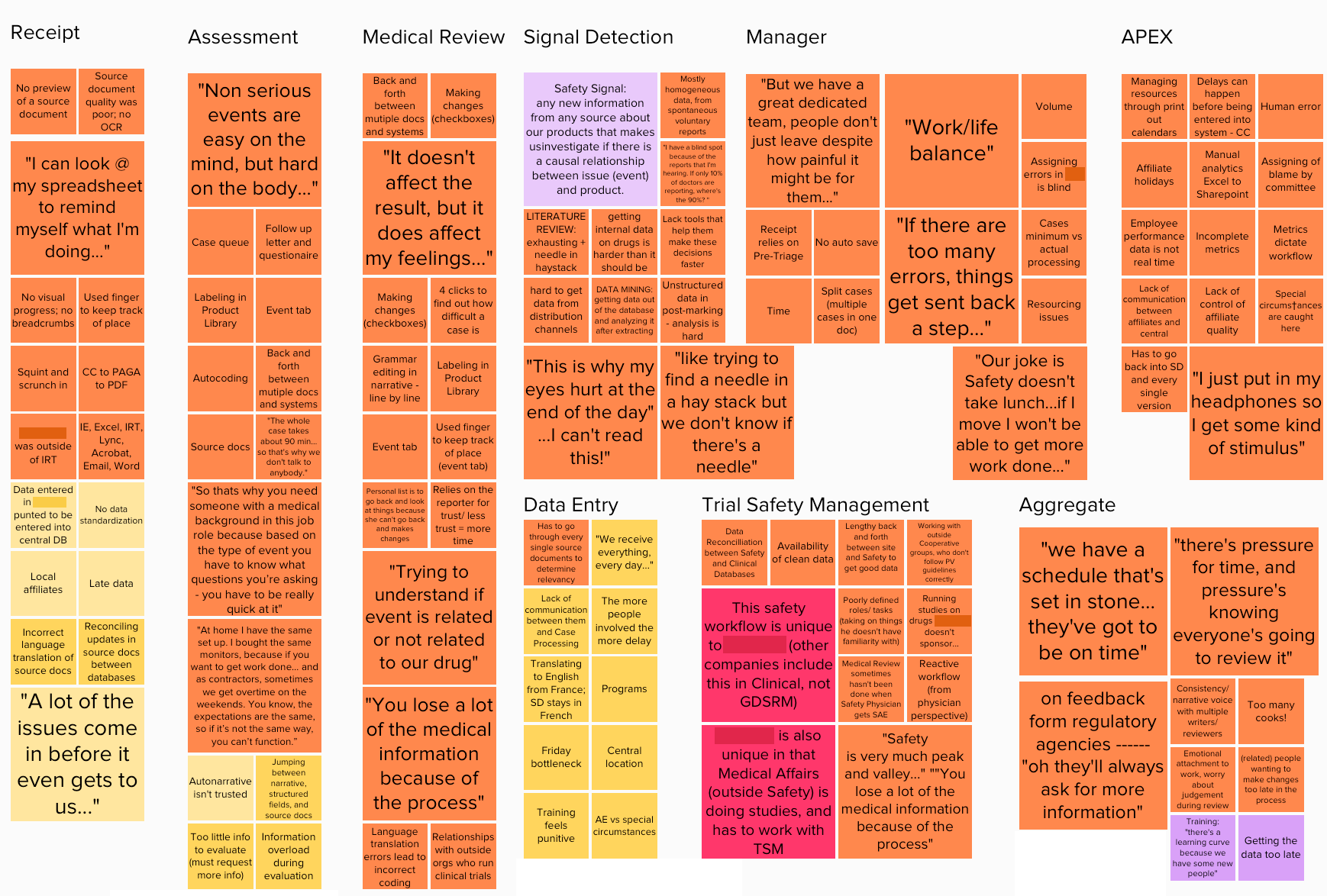
Images from a design thinking workshop on pharmacovigilance attended by industry experts
Domain + User Research
To begin unpacking that question, we first needed to understand the domain we were designing for — Pharmacovigilance (PV), also referred to as Patient Safety. PV is a vital part of the pharmaceutical industry, handling the processing and reporting of adverse events that occur due to a company’s drugs or therapies. To document the mammoth task of collecting, reviewing, and reporting cases, I co-facilitated a workshop with my team and fifty PV representatives from a variety of backgrounds to map the process and the people involved.
In addition, I conducted over 30 generative interviews during the initial months of the project, working with representatives from each department, to get a sense of what bottlenecks and pain points occur at each step of the process.
While each individual team member and department had its own set of pressures and inefficiencies, the interviews and user research showed a common group of concerns that spanned the entire process — time, volume, and quality.
Regardless of their responsibilities, all workers in the PV space felt the heavy pressure of time, as they were asked to complete an ever-growing volume of adverse event reports while still meeting quality standards outlined by HIPAA compliance documents, internal and external healthcare regulations.
With an understanding of what human-centered problems and system-level bottlenecks existed in the process, the team could begin designing and testing a new workflow that utilized AI applications to alleviate some of the stress. I conducted additional research sessions with over 80 users and stakeholders, spanning four companies and five countries, to get as diverse a perspective on global PV operations as possible.
“Sacrificial concepts” tested with users as part of the early stage design process
These research sessions consisted of both generative interviews as well as concept testing sessions. “Sacrificial concepts” and prototypes were developed to gauge participants’ familiarity and comfort with incorporating machine learning algorithms into their workflows.
We found that participants varied widely in how comfortable they felt with algorithmic recommendations but the criteria they used to evaluate remained consistent:
Trust — how confident can I be in what the system is telling me?
Transparency — what if I wanted to check system accuracy myself?
Feedback — how do provide updates to the system, and how much can it learn from my input?
These three criteria formed the litmus test for our prototypes moving forward, so that the experiences we designed would promote confidence, allow users to view the evidence and source materials used by algorithms to make decision, and provide input when needed to improve the system.
End-to-End Vision + Validation
We had the opportunity to build trust with these participants ourselves, returning to them with updated concepts and refining prototypes based on their user input as we converged on our final design. Through this process, we developed an end-to-end experience for how to effectively incorporate machine learning into Patient Safety. We pitched this vision to executives at multiple pharmaceutical companies and received very positive responses, one executive noting, “this looks like it was actually built by someone who knows PV… all of the white noise is removed.”
This ultimately is the goal of UX research in healthcare, to inform and develop a human-centered experience that gets buy-in from external clients, the internal team, and most importantly from the humans who will be interacting with the new system in the future. In addition to the end-to-end vision, I took on a UX Design role to help create the first release of the broader experience in 2017.


