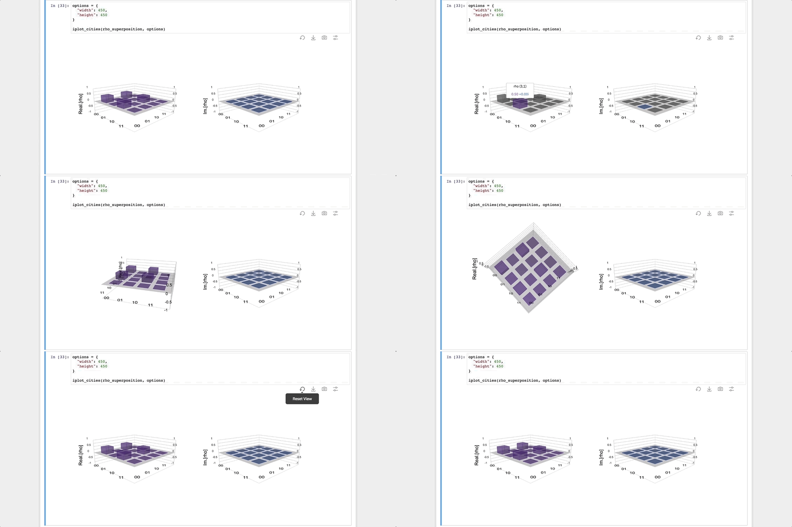
Coded prototype of cityscape visualization interaction
Visualizing Quantum Information
Team | Emerging Technologies Experiences Team, IBM Research
Responsibilities | Design Lead — User Research, Content, UX Design, Visualization Design
Project Overview
The Quantum Visualizations project represents a marked improvement in visualizing quantum state and output data within Qiskit, an open-source quantum computing framework developed by researchers at IBM. For this project, I led a small team of designers and developers to create new, custom interactive visualizations for Qiskit developers and quantum researchers to use within the online research tool Jupyter Notebooks. These visualizations are now available as part of Qiskit 0.6.0 and later.
Initial Research
This project began as collaboration between IBM Research team and Design. At the time, the visualizations that were available with Qiskit recycled Matplotlib capabilities, and so were not well suited to handling the exponentially increasing needs of displaying quantum data. To better inform our designs, I first conducted research into what each visualization was best suited to show, and what improvements could be made to better illustrate those characteristics. I also conducted a survey of how each visualization was currently being used, within Qiskit and in research publications.
Original visualizations highlighting issues such as legibility and lack of context
Precedent examples of visualized quantum data from research publications
Broadly, visualization users wanted three things —
More context on what information is being shown (better axes, legends, and color systems)
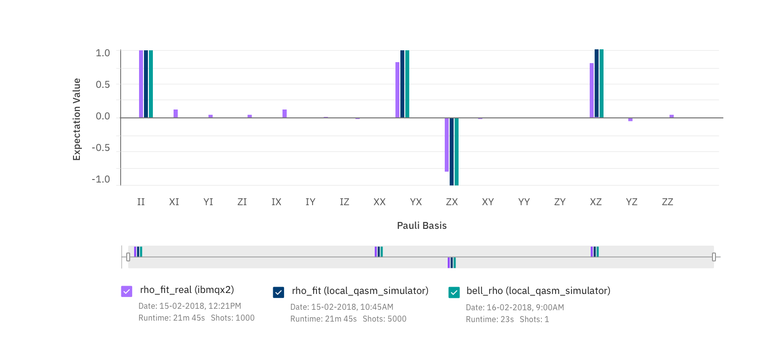
Better display and focus into large data sets (spaced out data, the ability to pan, zoom, and filter)
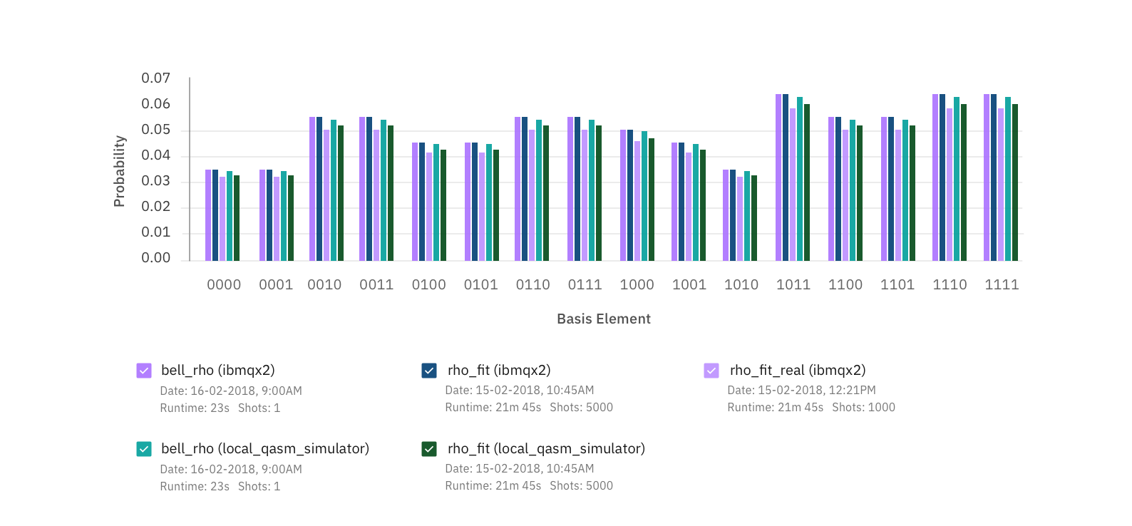
The ability to compare data between multiple runs, especially for the results histogram
Design + Usability Testing
With data on what each visualization was best at representing, I created 2D and 3D models of each visualization and developed a series of clickable UX prototypes, which simulated the experience of using the visualizations within Jupyter Notebooks. I then conducted a series of usability tests with researchers, students, and educators on what functionality was most valuable, and what interactions were easiest to discover and use. The feedback collected allowed us to iterate on our designs, provide recommendations for how to plot the visualizations in python, and suggest what customization functionality should be available for each visual.
3D model of cityscape diagram for UX prototype
UX and interaction prototype used to collect feedback from researchers, students, and educators
Final Designs
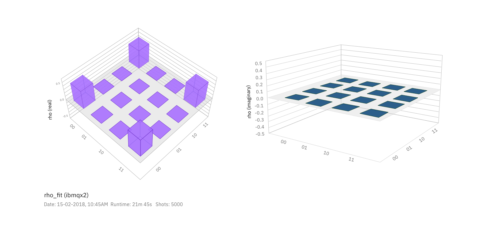
After feedback sessions with IBM researchers and external testing participants, the team converged upon a single interaction model for the visualizations. I then collaborated with a visual designer to update the look and feel of each visualization, improve legibility, and account for visual accessibility needs. We created the final designs, seen below, and worked with the Qiskit development team in code to modify and issue test the visualizations as they were being built.
The final visualizations were merged into Qiskit in August 2018, and into the new IBM Q Experience in March 2019.


