Quantum Education
Team | Emerging Technologies Experiences Team, IBM Research
Responsibilities | Design Lead — Project Management, Instructional Design, UX Design
User Research & Opportunitites
As a large company pursuing full-stack quantum computing research and development, IBM Q receives attention from a broad array of people. To better inform the designs, I led the educational team through an exercise to understand what each of our user groups might be looking for from our educational content.
Project Overview
As part of a broader effort to re-design IBM Quantum’s web presence, I had the opportunity to oversee a design overhaul of the content, organization, and presentation of a spectrum of quantum educational resources for IBM Quantum. I led four teams to redesign sections of the educational effort, and developed connections between sections to create a seamless educational experience.
Based on extensive demographic data collected by the team’s user researcher, we developed six broad personas — the general public, developers, industry professionals, students, researchers, and educators. While many people fit into multiple categories, these personas helped the team build empathy and better understand the diversity of our audience. In addition to understanding our users and their needs, we also conducted an audit of the existing educational material, and what improvements we could make from a structure, usability, and engagement perspective.
IBM Q’s existing learning and marketing resources.
User Guides, Composer, and Video Library found on the old IBM Quantum Experience website.
Educational content was, at the time, split between IBM Q’s marketing website and the IBM Q Experience, a portal that contained the Composer quantum interface, user guides, and video resources. In addition to updating the navigation and addressing stylistic differences, the content from the two sites needed to be rewritten and linked together into one cohesive experience on one unified website.
User Needs
Our next step was to identify what each section of our audience wanted to learn, and what they expected from the resources we currently provided. In addition to group-specific needs, it is helpful to gauge what our users want by level of willingness to engage and quantum skill level.
Everyone wanted a sense of what the impact quantum computing might have on them and more broadly, as well as the role IBM has in quantum computing.
Those who want to tinker wanted a fun way to engage with quantum and quickly start interacting with our tools.
Those who want to dive deeper wanted to find the learning path that best fits their level of expertise without feeling overwhelmed or discouraged.
Familiarity + Engagement spectrum, with target audience placement informed by user research.
Site Architecture + Navigation
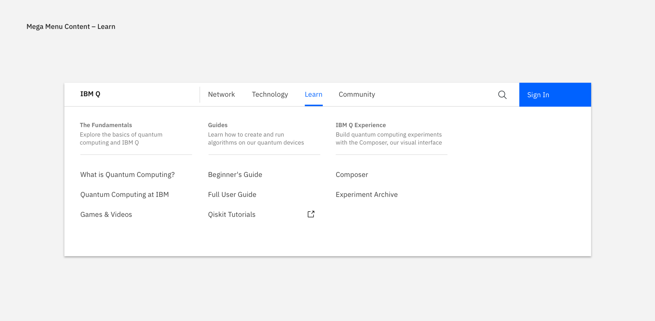
The familiarity + engagement map informed a consolidation of educational resources and a reorganization of the website’s information architecture. I created an organization to IBM Q’s existing educational content and tested iterations of the organization with a series of users from different backgrounds. The final structure was mapped onto a single mega menu navigation, which was helpfully titled “Learn.”
User testing revealed that people preferred to self select a path based on how they would be interacting with information, rather than following prescribed paths. The resources were therefore organized by level of involvement, not difficulty, and aimed to route both new and returning users to the correct resources on the site.
Content Redesign
With a new structure for quantum educational content and an understanding of what users wanted and expected from our resources, I led teams and acted as the UX Designer for a series projects to revamp our educational content and presentation: Quantum Basics for general audience and new visitors, User Guides for people learning to use our tools, the Quantum Composer to enable students and researchers to visualize and run quantum code, and the IBM Q Teacher Dashboard for students and educators to collaborate and share results.
In addition to managing the four projects, I worked with researchers and the IBM Q communications team to rewrite and update the content for both the Quantum Basics pages and the User Guides. I workshopped narratives and developed a cross-linking strategy between sections that guided users to additional resources and other relevant areas of the site. I then collaborated with visual designers and developers to build a new navigation structure and design layouts that catered to our audiences. Additional portfolio content on the Quantum Composer detail my specific involvement in that project.
Final Design Work
After several months of designing, iterating, getting feedback from internal scientists, developers, and external users, and incorporating those recommendations, we delivered the final design proposal for a new experience for IBM Q educational resources. Examples of these screens can be seen below.
Quantum basics final designs, including “What is quantum computing,” “Quantum computing at IBM,” and a “Games + Videos” library.
Redesigned educational productive use content, including the User Guides, Quantum Composer, and Teacher Dashboard.


